Neue Display-Technologien ermöglichen es heutzutage Bildschirme zu bauen, die nicht-rechteckig sind. Was auf der einen Seite neue Möglichkeiten für die Interaktion zwischen Menschen und ihrer physischen Umgebung eröffnet, bringt auf der anderen Seite eine große Herausforderung. Die Menschheit – außer Leser von Comics – ist es seit über 130 Jahren gewöhnt, Inhalte in rechteckiger Form zu konsumieren. Daher vermuten die Autoren, dass wir Menschen uns heute sehr schwer Inhalte zu erfassen, die keine rechteckige Form haben.
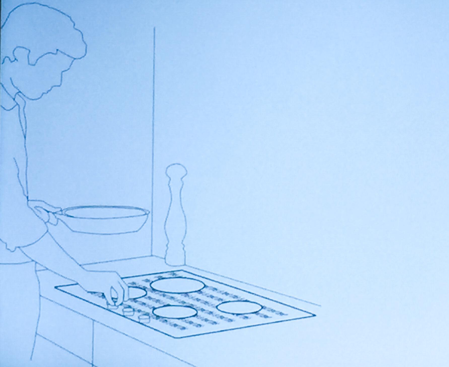
Die Autoren der Universitäten Toulouse, Bristol und Manitoba gingen daher der Frage nach, wie Text auf nicht-rechteckigen Displays gestaltet sein und dargestellt werden sollte, damit er trotz der Gewöhnung an rechteckige Inhalte gut lesbar ist. Sie veranstalteten zunächst Fokusgruppen um Ideen für nicht-rechtwinklige Oberflächen zu entwickeln. Dabei wurde beispielsweise die Idee für einen Herd entwickelt auf dessen Oberfläche beim Kochen Rezepte angezeigt werden.
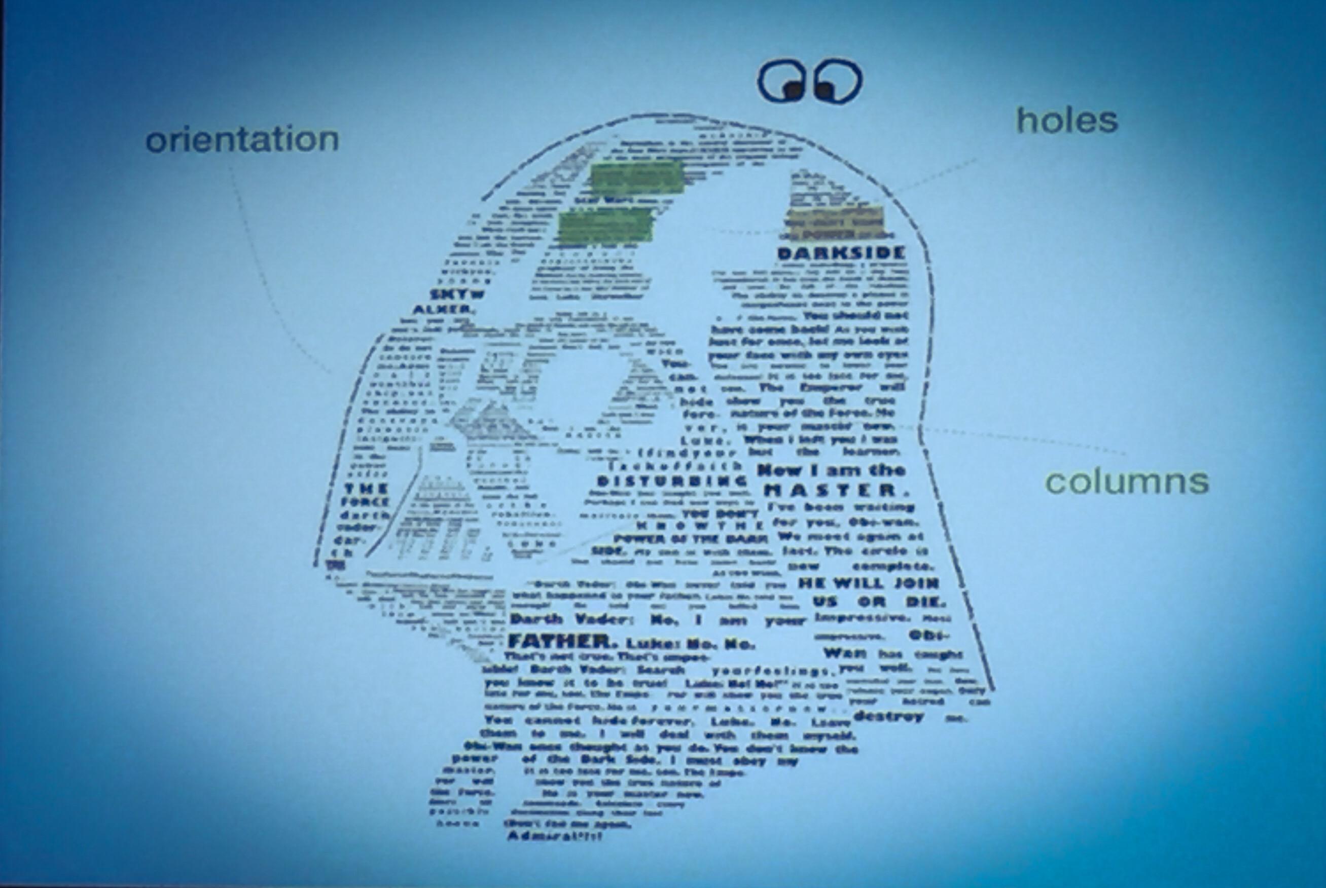
Dann erstellten sie unterschiedliche Gestaltungsvarianten für nicht-rechteckigen Text. Variiert wurden dabei die Kriterien Layout, Ausrichtung und Schriftgröße. Dann wurde mit Testpersonen getestet. Herausgekommen ist:
- Both left and right irregular alignments should be avoided, as text in these are perceived to be difficult to read and overall not aesthetic. Instead, symmetric shapes are preferred.
- Shapes with circular or sharp alignments are acceptable for presenting text: they are perceived to be easy to read, and overly clean, beautiful and interesting.
- If the shape contains a hole, text should be displayed using a broken layout with two columns around the hole to prevent any impact on reading performance.
- Shapes without holes are perceived to be less interesting than with holes. Thus, using holes in freeform shapes is not only a solution to context requirements (such as the cooktop), but also an aesthetical feature to explore.
- To use dynamic scrolling on non-rectangular shapes, text should be resized so that each line contains the same amount of text. Otherwise, use page scroll with constant text size.
- While resizing text for dynamically scrolling is perceived as beautiful and clean, resizing text with page scrolling raises mixed results. Some users disliked it because of display space loss and of varying interline spacing. Thus, resizing text should be limited to dynamic scrolling.
- Shapes with continuous line alignment where lines are cut by the shape curvature should be avoided as they are perceived to be difficult to read and non aesthetical. This is similar to the effect of holes on continuous text. Even though tangential alignment does not affect reading performance on linear shapes, continuous text should be preferred as it reduces the perceived difficulty.
- Text on very sharp shapes should be avoided, as text on these is harder to read than on linear shapes. If used, such shapes should be filled with continuous text rather than tangential that impacts reading performance.
Siehe auch
Investigating Text Legibility on Non-Rectangular Displays