Screenshot: cooper.com
Daniel Kuo published an article about the history, state of the art and future of typography for user interfaces at cooper.com:
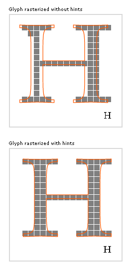
“Addressing an audience of information designers, Edward Tufte once explained that the fundamental challenge with presenting information is that the world we live in is high-resolution and multi-dimensional, yet all of our displays are most decidedly not. And while Tufte was initially referring to the problems of displaying rich data on paper, he was quick to point out that digital displays suffer the same problem but to an even greater degree. It may be tricky to map multiple axes of information (time, temperature, dollars, color, widgets sold, etc.) onto a two dimensional representation, but your difficulties are only compounded when you add the considerable handicap of reducing the target display resolution to a fraction of that of an equally sized piece of paper
(…)
In late 2004, Microsoft unveiled seven new fonts, collectively called the ClearType Font Collection6, at the ATypeI conference in Prague. To be released with the next generation Windows OS, Vista, and other future software packages, they were commissioned with onscreen legibility as their primary concern. As the name suggests, the collection was designed to leverage Microsoft’s ClearType technology, and it remains unclear how the fonts will perform without it. But unlike the core Web fonts, which themselves have recently been pulled from general distribution, the ClearType collection will not be freely downloadable. They are available for individual licensing across platforms, but Apple currently does not have plans to include them as part of their OS.
Displays are catching up, though very slowly. “Electronic paper” technology is becoming more mature, promising paper-like qualities (thin flexible displays with the same contrast ratio as paper—twice that of normal displays), but in its current incarnation is still limited to ~170 dpi (roughly the same as a newspaper), and is only available in black and white. Sony and Phillips have marketed an e-book based on the technology, which is currently on sale in Japan. The state of the art in LCD technology is just over 200 dpi, but is being targeted at specialized applications and is not widely available.
(…)”
Internetverweis
Typography and the User Interface